The Science Behind Traffic Signs
We encounter traffic signs every day, but have you ever stopped to wonder why they look the way they do? Even if you own a property or parking lot with signage that you’re responsible for, you probably never gave the design of traffic signs much thought. And that’s ok, because they are designed in such a way that we don’t focus on them. This might sound counterintuitive at first, but a lot of thought and research goes into their design. So, let’s dig into the science behind traffic signs.
The Design of Traffic Signs
Traffic signs employ what is known as ergonomic design. Let’s look at this definition of ergonomics:
Ergonomics involves designing the workplace to fit the needs of the worker rather than trying to make the worker adjust to the workplace. Good ergonomic design has been shown to increase work quality and production as well as worker well-being.
Now, just replace “workplace” with the road or parking lot and “worker” with driver, and you start to get a sense of how ergonomics can be an important part in the design of traffic signs. The point is to communicate information to a driver that requires them to do as little work as possible.

Courtesy of Brandon Industries
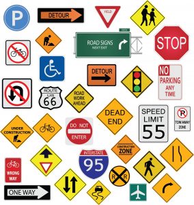
Specific principals of design used in traffic signs include spatial compatibility, conceptual compatibility, physical representation, frequency, standardization, singular functionality, and visibility. Some of these terms are self-explanatory such as standardization and visibility, others are more confusing.
Singular functionality means that a sign should communicate one, single idea. Physical representation is when a sign shows an image of something physical (i.e., a pedestrian crossing shows an image of a person walking). Conceptual compatibility might show a physical object, such as a plane, but context and additional information informs the driver that the sign is directing them towards an airport, not warning them to look out for planes.
Spatial compatibility takes into account the space the sign is occupying. A sign informing the driver to turn right should have an arrow curving to the right. Of course, this information is only useful if the sign is placed in the correct space. As you can see, lots of thought goes into designing traffic signs.
The Psychology of Traffic Signs
So, how can it be that traffic signs are designs so that we don’t focus on them? The idea is that a good traffic sign should tap into our subconscious. A driver should be able to receive information from the sign without ever stopping to think about it. Part of this is achieved through design and part of this is achieved through something called priming.
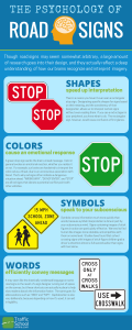
The design elements involved include shapes, colors, symbols, and words. See the infographic below from Traffic School Online for more detail on how each of these elements convey information. While our reaction to certain colors, such as red, might be hardwired into our brains, our reaction to certain shapes, such as octagons, are not.

Courtesy of Traffic School Online
So, what’s priming? Let’s check out this definition from Simply Psychology:
Priming is a non-conscious form of human implicit memory concerned with perceptual identification of words and objects. Priming can be associative, negative, positive, affective, conceptual, perceptual, repetitive, or semantic. The subtle effects which this complex psychological phenomenon encompasses can be employed to manipulate individual behavior.
Don’t worry, it’s not as complicated as it sounds. Let’s use stop signs as an example. The reason we associate octagons with stop signs is because it’s something we have learned overtime. Through a lifetime of repetition (experiencing octagonal stop signs over and over again) we can recognize stop signs immediately.
This is due to something called implicit memory. Explicit memory involves things you actively have to work to remember, such as the details of an historical event. Implicit memory involves the things you immediately remember without consciously thinking about them, such as recognizing a stop sign or tying your shoes.
Does My Property Need Traffic Signs?
As we explored in an earlier blog, the only signs you are required by law to have are handicap parking signs and fire zone signs. But other signs such as stop signs, pedestrian crossing signs, and direction signs will make your property or parking lot safer to navigate. What signage you do or do not have might also have an affect on your property insurance.
Dare can affix and repair your signage. We can do all your parking lot striping as well. We also install, repair, replace, and paint parking lot bollards. Are you ready to get started? Click below to get a quote today.


